
How to use a color wheel
Nov 22, 2021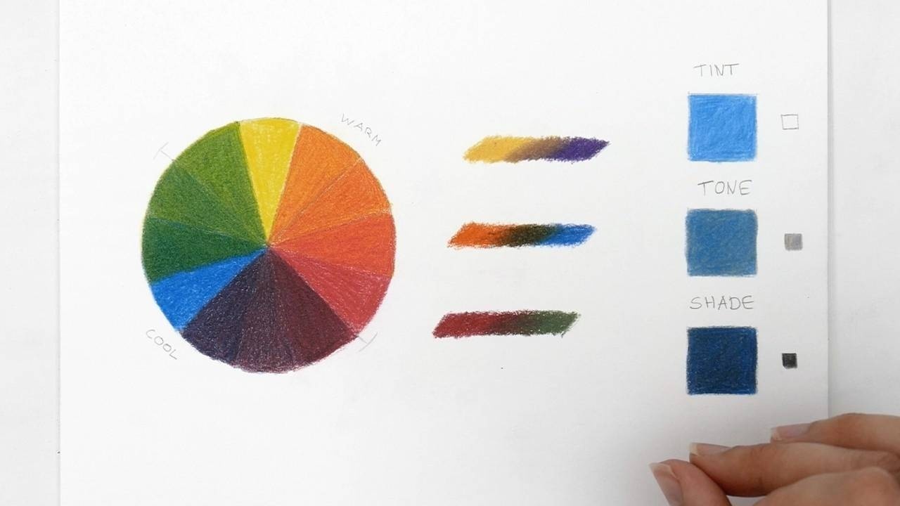
The best way to understand the relationship between colors and how colors mix is to create a color wheel. Once you understand how to use a color wheel you will be able to choose your colors with more intention and create more interesting artwork.
Types of color
- A color wheel starts with the primary colors yellow, red, and blue. These are original colors that can’t be created by mixing other colors.
- The secondary colors are a one-to-one mix of two primary colors. For example, one layer of yellow and one layer of red produce orange. When adding two layers of yellow and two layers of red you can create a darker orange and get a smooth finish.
- Tertiary colors are the combination of one primary and one secondary color. For example, yellow-orange is a combination of yellow (a primary color) and orange (a secondary color). So first you create the secondary color orange, and then you can add a layer of the primary color yellow.
The colors you choose as your primary colors will determine the rest of the colors on your color wheel. Obviously red and yellow create orange but by mixing a warm red and a cool yellow you will create a different kind of orange. Feel free to experiment with different colors by making several color wheels also using for example yellow, magenta, and cyan as the primary colors.
What are warm and cool colors?
Warm colors are yellow, orange, and red. To remember this you can think of the colors in a fire.
Cool colors are blue, purple, and green. You can think about water and ice.
Green is a cool color but there’s also a warm green. If you’re not sure if a color is cool or warm, look at which color is nearest to the color wheel. For example, if you’ve mixed a green color, does the color lean more towards the blue side or the yellow side. Blue being a cool color makes it a cool green and yellow being a warm color makes it a warm green.
Yellow and red are warm colors but there is also a cool yellow and cool red. You don’t have to study each pencil and know if it's a warm or a cool color. As long as you remember that if it leans more towards yellow or red it's warm and if it leans more towards blue or green it's a cool color. For highlights, you usually use warm colors and for shadows, you usually use cool colors.
Complementary colors
Complementary colors are two colors that are on opposite sides of the color wheel. Like red and green, blue and orange, yellow and purple. These are colors that complement each other and make your artwork stand out with high contrast when used together. You can also use a complementary color to lower the saturation of a color. If a color is too intense or bright, instead of using a grey to make it less bright you can use the complementary color and mix it with that color.
By mixing two complementary colors, the colors neutralize each other. You create a grey/brown color if you use a 50/50 mix. You can also use just a bit of a yellow to desaturate a purple or just a bit of a red to desaturate a green.
Purple, blue and green are cool colors and are colors often used when creating shadows in a portrait. Yellow, orange and red are warm colors that are often used for highlights in a portrait.
Tint, tone, and shade
It’s important to learn how to create a tint, a tone, and a shade. In the example photo (at the top of the article) we use the color blue, the three squares have been colored with the same color blue.
How to create them:
- To create a tint you need to mix the color with white. Depending on how much color or how much white you use you can create different tints.
- To create a tone you need to mix the color with a neutral grey. And again depending on how much blue or how much gray you use you can create a different tone.
- To create a shade you need to mix with black. Color with black first and then go over it with the color you chose. Depending on how much black you use the shade will be light or dark.
Remember tint, tone, and shade when you’re creating values. You can create a tint of a color when creating highlights, mix the white with a color to lighten it. Use the grey for the mid-tones or when you need a color to be desaturated. Use the black to create a shade of a color for the shadows. If you want to darken a color you will need to be careful. Use a color to color over the black because black can make a color look dull or make your artwork look flat. You can also try creating your own black by mixing dark brown and dark blue to get a richer black color.
Create your own color wheel and keep it on your desk or hang it on your wall. You can always refer back to it whenever you’re making color choices. At first, you might have to look at your color wheel more often but over time you will be able to remember the colors and the complementary colors.
Do you want to learn more about coloring techniques? Have a look at the step by step video lessons in the membership covering everything from basics to portraits…
Read more details about the membership here and join us today so you can start practicing.
Emmy
Want to be notified of new blog posts?
Sign up and you'll receive an email when a new blog is posted.
We won't send spam and you can unsubscribe at any time.